
Identity design springs from the geometric transformation of the organic 'Dot'.

Work

Project info
StudioDot, an Architectural firm based in Bhuj, is an esteemed multidisciplinary design studio whose primary focus is to explore and experiment along all the realms of design. In addition, the studio operates with strong working ethics. With such an eminent reputation, we believe that the visual identity has to be in synchrony with their working philosophy.
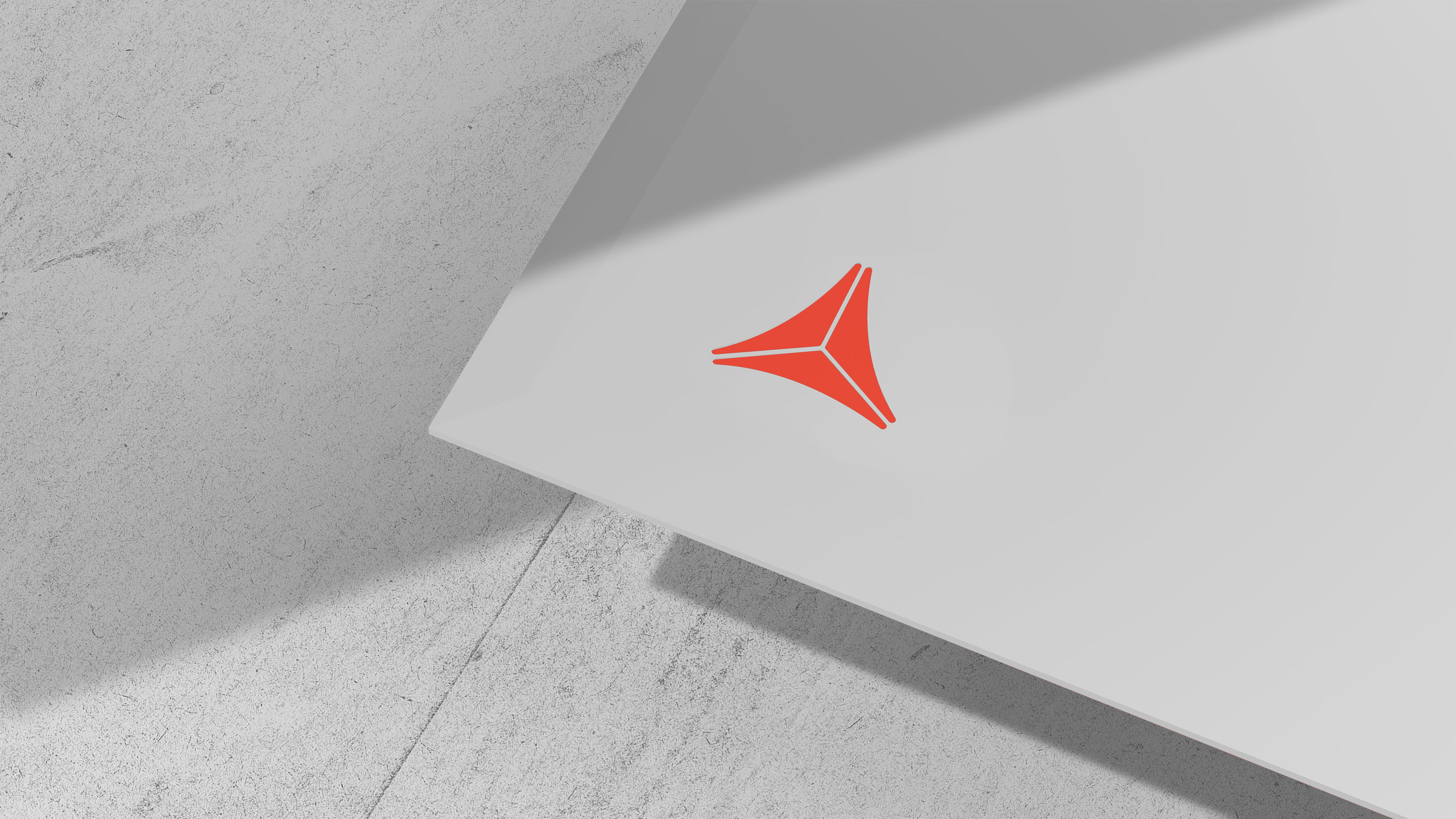
StudioDot - a name derived from the philosophy that states “beauty lies in imperfection”. A ‘Dot’ being geometrically disfigured is apt for the depiction. The visual identity got conceptualized enhancing the inexact organic character of a dot. With the rigorous and conscious effort to achieve the best proportions, multifold experiments were laid down with the use of Geomanist fonts designed by Atipo Foundry. Henceforth, the identity created with in-depth research resulted into the best fit for all formats and scales.
Moreover, the studio believed that in profession, work is reflection of the cyclic support of imaginator, investor and the executor. The logo inculcates this invisible triangle of sustenance, emphasizing on this trifold connect. Thus, adopting the design brief a long lasting creative solution got manifested.
Visual Identity
Brand Guidelines


Next project
that deserves your attention
Stay informed - join our mailing list
.png)
.png)